cards
cards
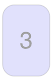
Some of my other posts use the notion of a card. Initially, I was content to just use a square with a nunber in it. A friend pointed out that cards are taller than they are wide. So the improved card looked like this.
That got me thinking about the user experience with the programs on my site. A more engaging visual element is not just delightful for the user, it also presents interesting graphic design, usability, and coding problems. And of course, we can then reuse it on other posts. So how can we improve the humble card above? And how do we implement it?
A reasonable starting point would be to display a card that looks like a traditional playing card:

Display an Image?
My first thought was to look online for card images, perhaps SVG since they are scalable. The three of hearts above is just that. But I ran into difficulties when I wanted to use the SVG cards on this site.
This site is built with Svelte, hosted on vercel, and I use p5js to build the interactive programs in my posts. p5 can load PNG and JPG images, but not SVG. Fine, I can export the images to PNG. I added the images to my local copy of the website, and the images worked fine in my p5 app. But when I deployed my website to vercel, it wasn’t happy that the p5 script was trying to load files from disk. I started to work on fixing that, but by now, I was starting to rethink whether I wanted to use someone else’s card images anyway. I wanted more control over the experience.
With my own cards, I could come up with interesting variations. This is a math-oriented site, so we could use cardioids instead of hearts. Perhaps I could animate the card notations, because why should a card displayed on a device behave like it is a physical, static playing card?
So here is the design trajectory. As I write this, I have nothing. Let’s do some iterative design…
A rectangle
We could consider alternative shapes, but designs need constraints, so for now it will be a rectangle. A little online search revealed standard bridge and casino cards are 2.25” x 3.5. Like real playing cards, we’ll round the corners about 1/8”. You know, makes those digital cards easier to shuffle, and keeps the corners from getting damaged.

This is a bit narrower than the three of of hearts above, which I am guessing is modeled on the wider poker playing card. It’s funny the odd trivia you acquire as you research a design.
First version
If I am only going to create one card design, I’d like it to be recognizable. I’ll be coding the shapes on the cards, which is easy enough except for the face cards. Hmm. We’ll cross that bridge later. The simplest of the four suits is diamonds, so let’s start there. The three of diamonds below is drawn with p5, wrapped in a svelte component.
I wanted a typeface that looked like a classic playing card, and found a satisfactory font online named Card Characters. Loading the font via p5’s loadFont(filePath) brought the same security problem with vercel that I’d had earlier with loading images. But by adding the font to my Card component’s <style> tag, I could use p5’s setFont() instead. I enlarged the numbers a bit for readability.
Supporting all ordinal values
Next up was to expand beyond just the three of Diamonds. I followed the traditional numbering patterns for 2 through 10. The ace and the face cards special handling, and I decided to go for simple, at least for now.
Flipping
We need to be able to flip a card. Click on the card below.
Rotation
One of the card games I have in mind will require a card to be rotated…